LONG BEACH, Calif. – The cause is worthwhile. The name — Killah Beez — is awesome. The logo…needed a bit of work.
Killah Beez is an affordable youth sports program based in Long Beach, Calif., and its mission is to help local kids build life skills through sports. While the group’s original logo had some important stinging insect elements (e.g., honeycomb design), it needed updating and some “entomological stylings.”
Enter Orkin. It just so happens Orkin was seeking such a project as part of its #BugWeek, which had as its goal “correcting misinformation around common insects by fixing everything that’s wrong with bugs in pop culture.”
“For this year’s BugWeek, we wanted to include a give-back component — something that tugs at the heart strings — so we asked our agency to find a non-profit whose logo needed some help,” said Brian Harrison, marketing director, Orkin. The agency connected Orkin with Killah Beez and its coach, Allan Valente. Coincidentally, Ben Johns, region safety and service manager, Orkin, has a nephew on the Killah Beez and both vouched for the great work being done by this group.
“We liked that their mission was helping kids build confidence and leadership skills and providing great coaching at an affordable rate,” Harrison said.
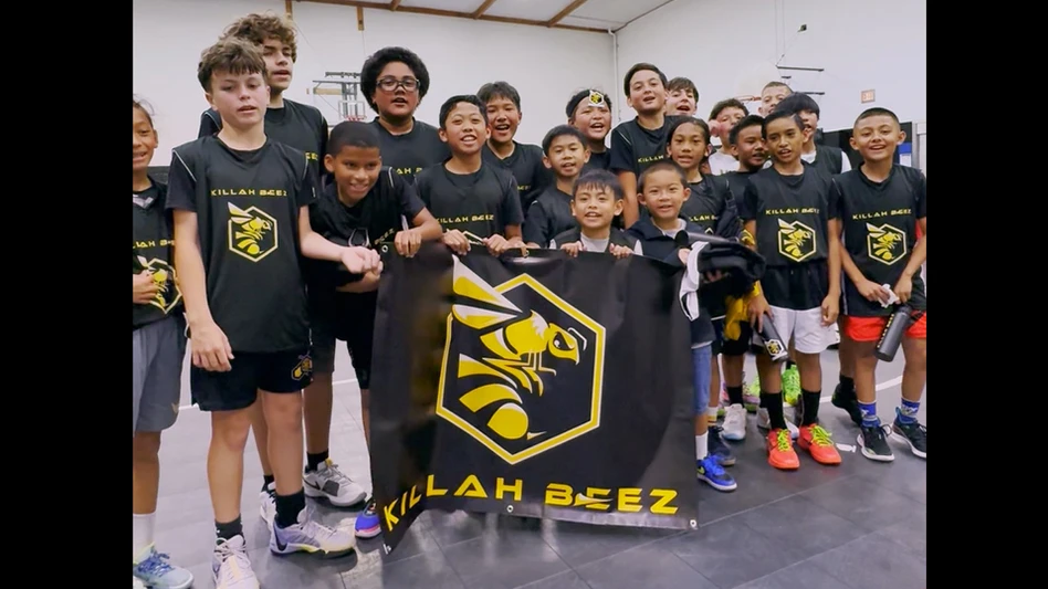
In terms of the redesign, it started with the existing logo, which included what Harrison called an “abstract bee.” Killah Beez is part of the Honeycomb Paradigm Project, a non-profit focused on enriching and developing youth in five aspects (1) education, (2) health, (3) career planning, (4) culture and (5) athletics. All five represent a different point on a honeycomb, which is one of the reasons the team chose Killah Beez as its logo and wanted to retain the honeycomb design as part of the logo redesign.
With these goals in mind, Orkin’s agency then went to work on the redesign with guidance from Danielle Restuccia, technical services manager, Northeast, Orkin.
“We first wanted to make it an obvious bee, rather than just the honeycomb with wings, but we also wanted to incorporate the honeycomb,” Restuccia said. “Africanized bees (aka, killer bees) do make honey in hexagonal cells, just like regular bees, so we put the bees against the backdrop of a hexagon. It has the black and yellow stripe pattern, which is common to most bees and the presence of the stinger, which is the most dangerous part of the Africanized bee. So, we made sure all of those parts were in the redesign.”
Some of the nuances, like the stinger and stripe pattern, helped make the new design entomologically correct, said Restuccia, who added, “the first draft looked pretty good, but the bee was a little pointy, more like a wasp, so I suggested they make the abdomen more rounded.”
With the design complete, up next was the unveiling. Orkin presented the team with its "killah” new logo, along with new merchandise Orkin purchased that included water bottles, sweatshirts, stickers and a new banner for their gym. Also, as part of the unveiling, Orkin educated the kids by pointing out some of the entomological features of the Africanized bee in the new logo. Harrison said the kids were excited about the new design and merchandise. Orkin’s Ben Johns emailed that his nephew and the rest of the team “were really stoked about the logo, water bottle, shirts, etc.”
As the Orkin face of this initiative, Restuccia said it was gratifying to share her science knowledge and to represent Orkin as a woman in a traditionally male-dominated field. “On social media, I’ve seen some real positive comments from other women STEM professionals, so that has been really cool, too.”